


︎ Stacklok Explainer Video
I designed, illustrated and animated an explainer video for tech startup Stacklok.
Using ice cream production and consumption as a metaphor, we explain how Stacklok’s products Minder and Trusty work together to secure the software supply chain from malicious attacks.
Click here for the full video, or watch the embedded video on the right.


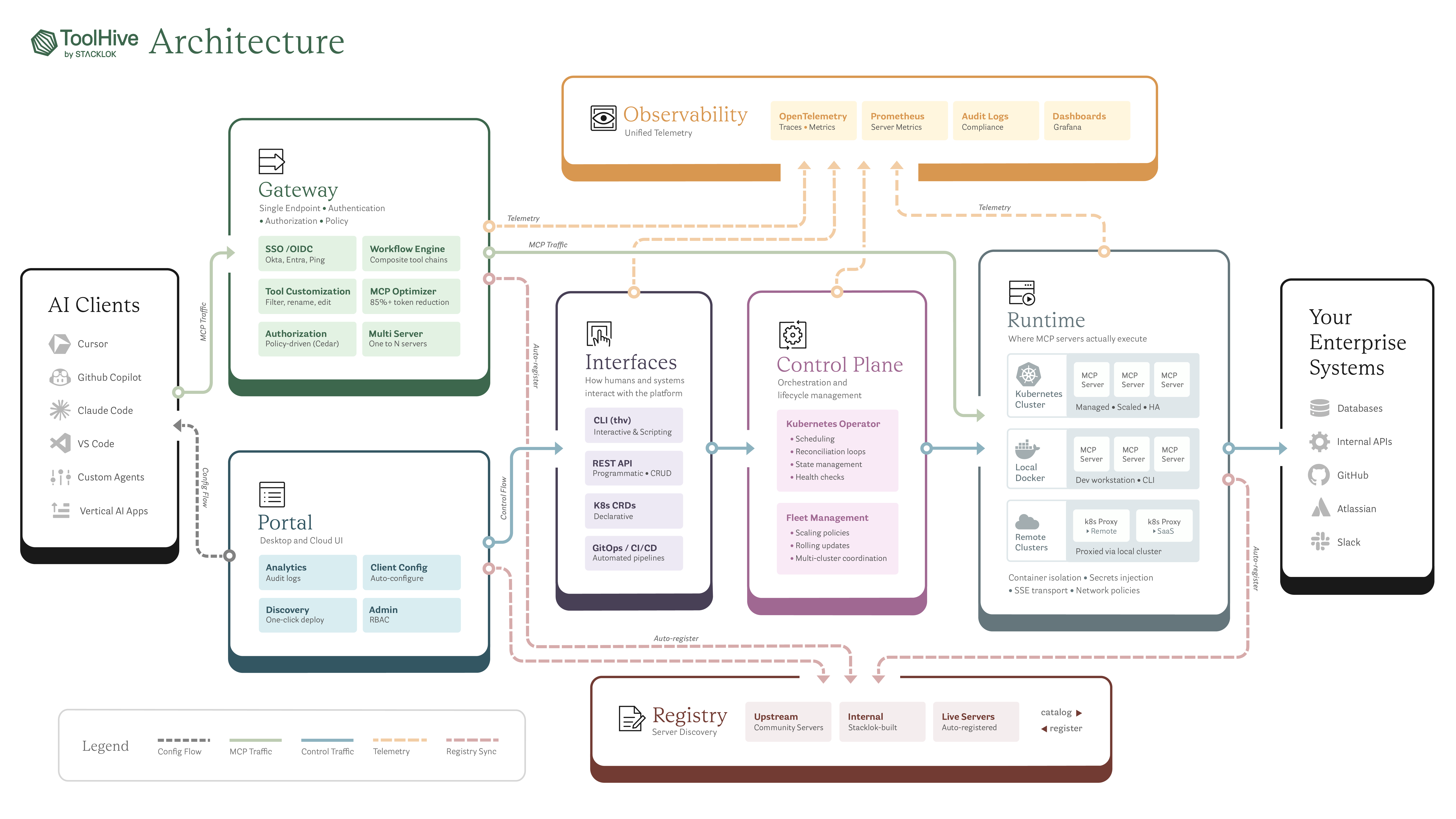
︎ ToolHive Architecture Diagram
This diagram visualizes the full ToolHive platform, from AI clients and gateways through orchestration, runtime, and enterprise systems. The primary challenge was making a highly complex system readable at a glance without flattening the technical nuance.
I focused on hierarchy, flow, and consistency, extending Stacklok’s brand with custom iconography and a restrained color system to guide the eye and clarify responsibility, traffic types, and system boundaries. I aimed to create an architecture diagram that feels approachable while still communicating real infrastructure complexity.
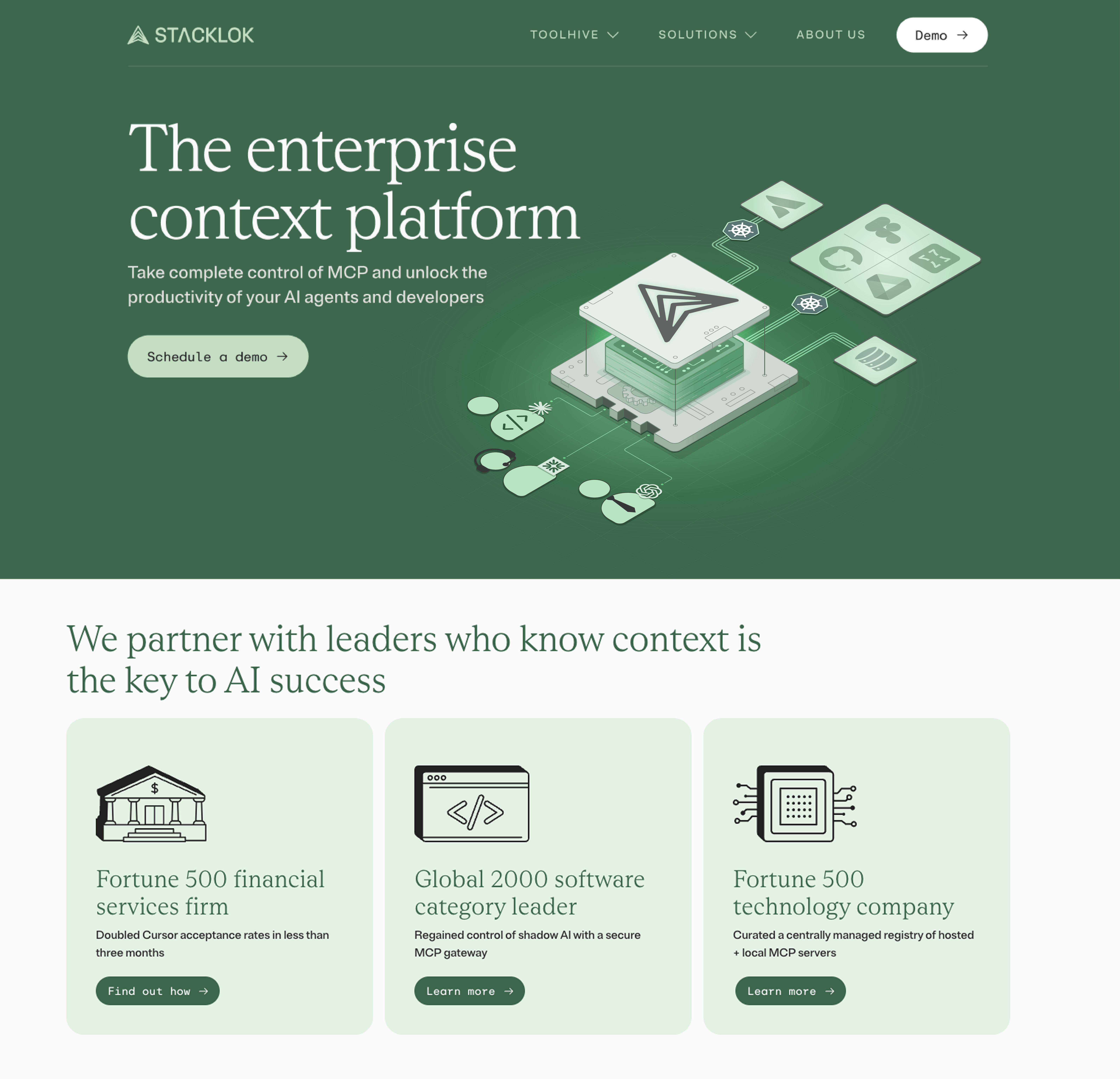
︎ Stacklok.com Hero Image + Icons set
I created the homepage hero and a modular icon system for the Stacklok.com redesign. The hero illustrates Stacklok’s MCP platform as a structured, interconnected system, adding visual interest without distracting from the core messaging. The accompanying icon set was built as a cohesive system with consistent geometry and styling, designed to scale across customer stories, feature sections, and product pages.

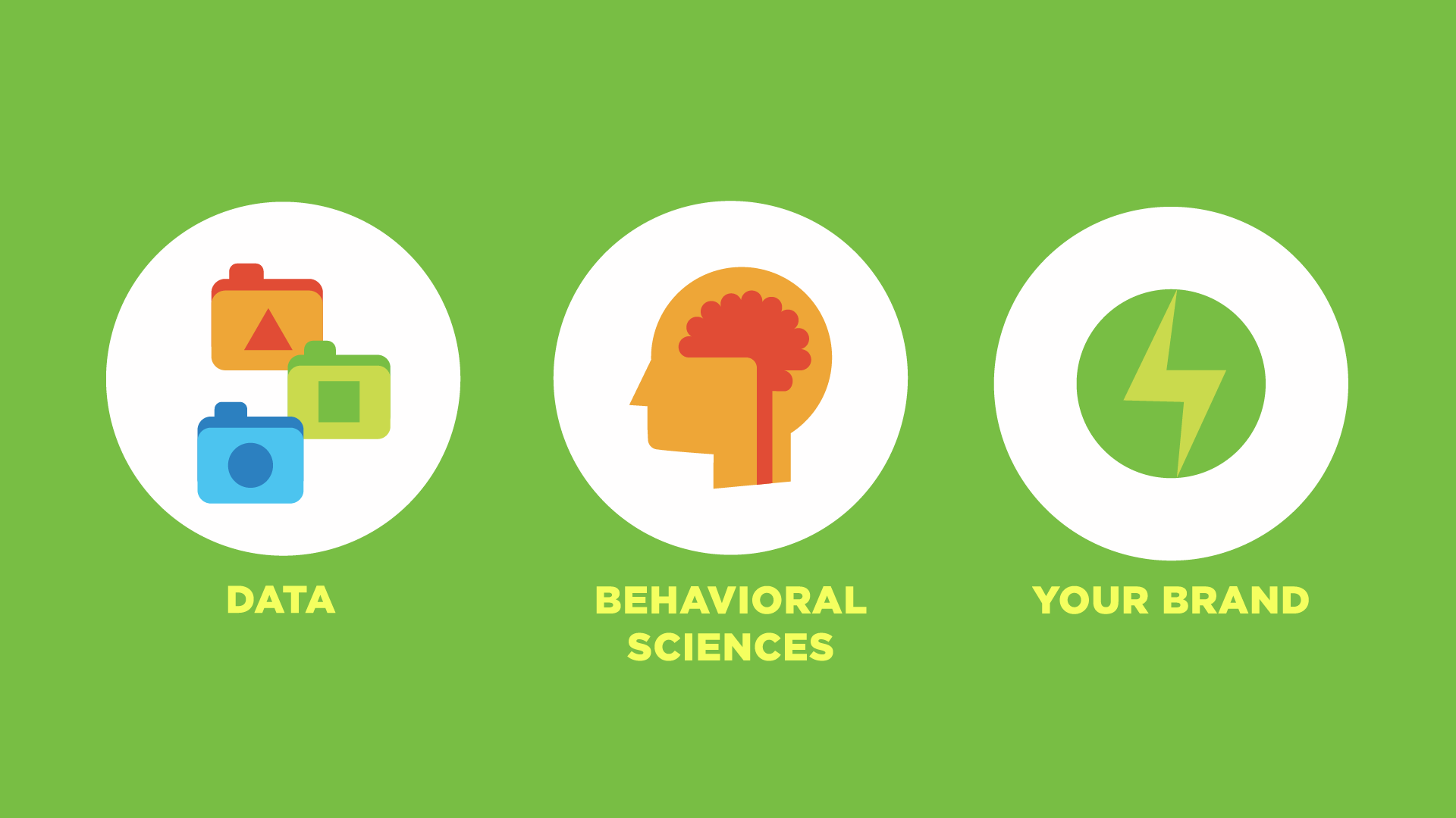
︎ CleaResult Video
I designed, storyboarded and animated this video with Cyclops for the eco-consulting firm CleaResult.
I used a simple color scheme with cute geometric shapes to keep things simple and engaging while teaching viewers how to make environmentally friendly decisions within their daily habits.
Click here to view the full video.